The trendline will be correctly plotted but the equation displayed may give you incorrect results if you try to plug and calculate x values manually.
How to solve it?
Let’s see a quick example by plotting the following data set
Plotting Scatter Chart
- select your data set and plot it by selecting XY scatter diagram and continue pressing the Next tab as appropriate
- once you have your graph you can add a trend line to your scattered points,
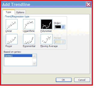
To do that: click on one of the points and right click and choose Add Trend lines.
Chose which ever type of trend you decide for the curve fitting of your data
Press the Options Tab and check the “Display equation on chart” option
The equation will be displayed and you can select it and can move and place it where ever you want in the chart area
Now if you take this equation (shown on the upper right corner) and plug some X-values it will give you incorrect corresponding y-values.
Microsoft actually says “…..Microsoft Excel plots trendlines correctly. However, the equation that is displayed may give incorrect results when you manually type x values. For appearance, each x value is rounded in the number of significant digits that are displayed in the chart. This behaviour allows the equation to occupy less space in the chart area. However, the accuracy of the chart is significantly reduced, which can cause a trend to appear to be incorrect…..this behaviour is by design”
How to correct it?
- Select the equation and right click on it and choose Format Data Labeles…
- Press the Number tab and select Number in Category: then set the Decimal places to some larger number say 15,20 or 30 -an amount which will accommodate all your valuable non zero figures
Now you have your correct equation to work with!


It works!
ReplyDeleteEquation remains the same for me MAC excel, :-( !!! i hate you microsoft.
ReplyDelete